Project Title
Size – 1,200 sf
Phase: Concept Design
Program: Restaurant
Adaptive Reuse
Location – Orlando, FL
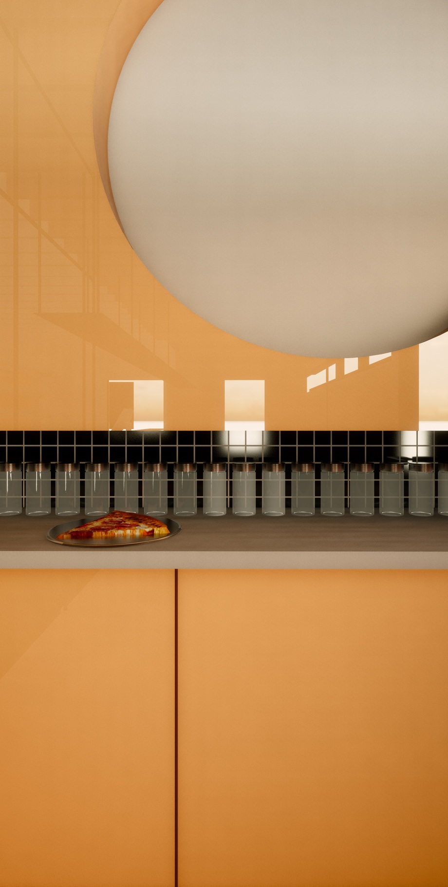
Driven by the brightly, colored graphics and sharp geometries of the ‘Slice’ logo, the space boldly amplifies its energy from the exterior façade to the millwork details. The logo, undoubtedly referential of the 1980’s, echoes the plastic textures and electric colors of the 1980’s. The architecture utilizes color, light and measure as a playful nod to that time period.
The existing building is linear in nature, which allowed for a clearly organized and efficient floor plan. Customer’s enter on the right, while employees showcase the craft of pizza making on the left side of the storefront. As one moves further back into the space, they are guided by electric- pink, linear lighting that also transforms the space at night.
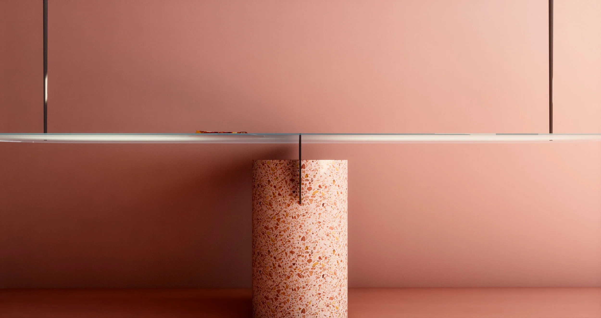
The front of house space is divided and activated by a polycarbonate screen wall that doubles as a shelving unit for the pizza boxes hanging above. The architecture continues to amplify the brand identity.
While the interior glows a bright pink, the exterior sits monochromatically along the street edge. This allows for an interesting duality. In the land of white stucco buildings, the fluted, black box grabs the attention of the passersby. In contrast, at night, the black façade fades to the background, as the pink interior radiates from within, pulling customers from the street, like a moth to a flame.


